Saturday, 30 March 2013
Wednesday, 27 March 2013
How did you use media technologies in the construction and research, planning and evaluation stages?
For the duration of this project wherever its in the main task or ancillary texts technology has been a major part of the success of both stages. Without the input of technology society would not be shaped in the way it is today, the impact of technology to a certain extent has shaped the media forms produced today. In terms of our project the concept of making a film trailer would not have been possible if it wasn't due to the technological developments of programmes on offer today.
 Although, it could be argued that a fundamental key to constructing, researching and planning was the internet. The internet was use for a wide range of different purposes however, the main purpose was research. Research was a vital part of our project, the main websites we used were google youtube and twitter. Social networking sites such as twitter were used to aid our audience feedback. We posted our videos onto twitter so that we could get audience feedback. However, in terms of the internet youtube has been a massive part of our planning and research. The impact of the technologies today has meant that access is instant. This is similar for all media technologies with advanced technological development access to what you want via media platforms is instant and becoming more common in society.

Different technologies are best suited for different people. With this mind with divided our group into job rolls for each member. Editing was our main issue as none of us had much experience using windows live movie maker, however this was overcome through practice. Additionally, following some controversy using windows live movie maker we had to use garageband which enabled us to incorporate voice overs as well as using background sound. Using garage band meant that we could also fade in and out the music more effectively.
When constructing media forms such as the film poster and magazine front cover I used a variety of different programmes that impacted on me being able to manipulate the perfect photo conveying the visual elements of our film trailer. Using serif page plus to construct my film poster and magazine front cover was a great programme
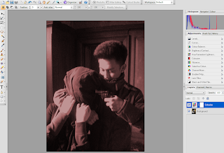
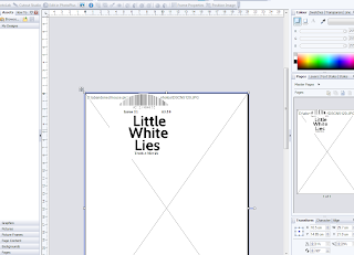 as it allowed me to easily move and change objects aswell as manipulate the page to best suit my target audience. By this I changed the visual style of my font making it bolder and wider to stand out. Additionally cropping my photos so they would fit perfectly on the page. In terms of editing pictures, this was done by using serif photo plus. I spent a considerable time editing photos so they would reflect the representation I was hoping for that would be appealing to my target audience. By this, I changed the saturation and the colour in several photos as it fitted the codes and conventions of an action genre film poster and made the picture more mysterious and iconic.

The influence of technological convergence on the world of media today is massive. Technological convergence refers to the tendency for different technological systems to evolve towards performing the same task. By this, it means that everything is becoming accessible on different media platforms. With developing technology this impacted massively on our project as technological convergence has meant that through the computer we can now search the internet with the click of a button and upload photos from our mobile devices.
Difficulties
The project at times did not go as smoothly as we hoped. At times especially during editing and importing the data was a major problem and we experienced a wide range of different error messages.
"Unable to upload" "Error.Try again" "Windows Live Movie Maker Error" "Not Responding, Force Quit"
This was mainly due to the quality of the film being to high quality for the movie maker to render therefore it caused the program to crash. This also happened on garage band after editing our soundtracks and uploading the voice overs the program crashed and this impacted on us loosing all of our work which was highly annoying.
 Although, it could be argued that a fundamental key to constructing, researching and planning was the internet. The internet was use for a wide range of different purposes however, the main purpose was research. Research was a vital part of our project, the main websites we used were google youtube and twitter. Social networking sites such as twitter were used to aid our audience feedback. We posted our videos onto twitter so that we could get audience feedback. However, in terms of the internet youtube has been a massive part of our planning and research. The impact of the technologies today has meant that access is instant. This is similar for all media technologies with advanced technological development access to what you want via media platforms is instant and becoming more common in society.
Blogger is an online website which allows you to construct your own blog. All of my posters were administrated using labels therefore they could be easily sorted and accessed. Without the application of using blogger my work would of significantly suffered as I would of had no way of keeping track on my work.

Different technologies are best suited for different people. With this mind with divided our group into job rolls for each member. Editing was our main issue as none of us had much experience using windows live movie maker, however this was overcome through practice. Additionally, following some controversy using windows live movie maker we had to use garageband which enabled us to incorporate voice overs as well as using background sound. Using garage band meant that we could also fade in and out the music more effectively.
When constructing media forms such as the film poster and magazine front cover I used a variety of different programmes that impacted on me being able to manipulate the perfect photo conveying the visual elements of our film trailer. Using serif page plus to construct my film poster and magazine front cover was a great programme

 as it allowed me to easily move and change objects aswell as manipulate the page to best suit my target audience. By this I changed the visual style of my font making it bolder and wider to stand out. Additionally cropping my photos so they would fit perfectly on the page. In terms of editing pictures, this was done by using serif photo plus. I spent a considerable time editing photos so they would reflect the representation I was hoping for that would be appealing to my target audience. By this, I changed the saturation and the colour in several photos as it fitted the codes and conventions of an action genre film poster and made the picture more mysterious and iconic.
Prezi has also massively influenced the project. Prezi was used on numerous occasions, we first started using prezi to collaborate ideas for our presentation. Prezi is a very useful tool for presenting work as it enables you to embed videos and insert photos. Throughout the duration of this project prezi has been vital for presenting work and the free edition is still highly efficient.
The influence of technological convergence on the world of media today is massive. Technological convergence refers to the tendency for different technological systems to evolve towards performing the same task. By this, it means that everything is becoming accessible on different media platforms. With developing technology this impacted massively on our project as technological convergence has meant that through the computer we can now search the internet with the click of a button and upload photos from our mobile devices.
Difficulties
The project at times did not go as smoothly as we hoped. At times especially during editing and importing the data was a major problem and we experienced a wide range of different error messages.
"Unable to upload" "Error.Try again" "Windows Live Movie Maker Error" "Not Responding, Force Quit"
This was mainly due to the quality of the film being to high quality for the movie maker to render therefore it caused the program to crash. This also happened on garage band after editing our soundtracks and uploading the voice overs the program crashed and this impacted on us loosing all of our work which was highly annoying.
Saturday, 23 March 2013
How effective is the combination of your main task and ancillary texts?
The most important aspect when combining our main tasks with our ancillary texts is maintaining all the appropriate pleasing properties that were included in the film trailer, film poster and film front cover magazine. Ensuring that we maintain a suitable and clear style throughout our main tasks this has constructed synergy and our audience can see this association and link between our media forms.
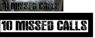 For our audience pitching to a mass audience it was crucial that we decided on a suitable font that would appeal to our target audience. Using DAFONT we established the font "ActionBold" that replicated exactly what we were looking for. The next step was incorporating our font into our film trailer and our film poster as my magazine was "little white lies" incorporating our film title into this would of gone against the little white lies concept therefore the film title was not added to the magazine front cover. Using synergy is also important, in this case our synergy was created by all three media forms, iconic pictures were manipulated on both the film poster and the magazine as replicating the main actors is also another method used to create synergy.
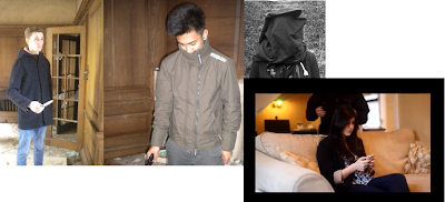
Clothing was also a fundamental factor when combining the link between the main task and ancillary texts. Throughout the clothing was kept specific to fit the criteria needed of their roles. Researching into what our characters was not a problem as we simply wore what we would normally wear being school students. Although linking to our ancillary texts we ensured to the decoder that this would be done through using the same clothes in the magazine front cover, film poster and the film trailer.
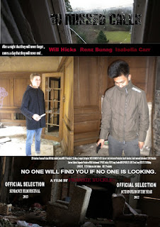
 Furthermore, colour is another way that will attract our target audience. Our colour preferences needed to be outlined in our film poster and magazine poster to portray the concept of our film trailer. By this I mean that the film poster needs vast amounts of light however with a contrast of dark to make it stand out. This will also replicate our film trailer that has a transition of light to dark .
 For our audience pitching to a mass audience it was crucial that we decided on a suitable font that would appeal to our target audience. Using DAFONT we established the font "ActionBold" that replicated exactly what we were looking for. The next step was incorporating our font into our film trailer and our film poster as my magazine was "little white lies" incorporating our film title into this would of gone against the little white lies concept therefore the film title was not added to the magazine front cover. Using synergy is also important, in this case our synergy was created by all three media forms, iconic pictures were manipulated on both the film poster and the magazine as replicating the main actors is also another method used to create synergy.
Clothing was also a fundamental factor when combining the link between the main task and ancillary texts. Throughout the clothing was kept specific to fit the criteria needed of their roles. Researching into what our characters was not a problem as we simply wore what we would normally wear being school students. Although linking to our ancillary texts we ensured to the decoder that this would be done through using the same clothes in the magazine front cover, film poster and the film trailer.

 Furthermore, colour is another way that will attract our target audience. Our colour preferences needed to be outlined in our film poster and magazine poster to portray the concept of our film trailer. By this I mean that the film poster needs vast amounts of light however with a contrast of dark to make it stand out. This will also replicate our film trailer that has a transition of light to dark .
The only difficult aspect of creating synergy was through creating a consistent symbol that we could relate to our film poster and magazine as well as our film trailer. Selecting an action genre meant that this would be a difficult task. So be improvising we used ancillary texts to reflect the symbolism. By this we incorporated our tag line into not just our film trailer but also into our film poster which reflected the symbolism of passion and the pain that the couple had gone through. Furthermore, in terms of the magazine creating a suitable magazine that would reflect the same codes and conventions of the film poster and film trailer was also a difficult task. Little white lies are usually bright and colourful and in some aspects reflecting happiness and passion. However, I used editing and an iconic picture to contradict this concept and aimed in making my magazine reflect pain and a sense of feeling "trapped". This shows that even when attaining synergy through all media formats their is always one aspect that is harder to create synergy.
Overall I feel that using forms and conventions as a platform was pivotal to create synergy, I feel the process throughout the production of these tasks has gone very well and I have in-turn, created three products that can relate to the same film trailer. With this in mind I feel the aspects I used create a combination between all three, which gives a good idea of the genre and target audience of the film, therefore its evident that the combination is highly effective.
Wednesday, 20 March 2013
Sunday, 17 March 2013
Audience Feedback
10 Missed Calls Feedback
"I really liked the trailer for 10 missed calls, throughout the whole trailer I was on edge. For me the Music worked really well and anchored the shots making them more effective. The acting was also pretty good I liked the fact that you didn't use much dialogue and let the sound create the tension"
"10 missed calls trailer was excellent! the music and sound effects and the opening shot was amazing. I liked the fact the locations differed it was really clever and professional. I really want to know what happens in the end. I would definitely go and see it at the cinema"
"The trailer overall was very good. I feel that it was clear about the plot but did not give to much away. However, I felt that with a lack of dialogue I didn't really feel on edge"
" I really enjoy watching the media piece, It was very good and definitely reflected an atmospheric trailer. It was professional and worked very well I would definitely go and see this film the characters all worked really well together it is clear that it took a lot of time to do"
Saturday, 16 March 2013
10 Missed Calls Film Trailer
http://www.youtube.com/watch?v=ZhZ7r7wJ1Cc
This is our finished film trailer, the video is unable to be found through searching on the youtube videos.
This is our finished film trailer, the video is unable to be found through searching on the youtube videos.
Sunday, 10 March 2013
Trailer Feedback
Thursday, 14 February 2013
Film Poster Process
Today I have finished my film poster, the process of creating a film poster has been long but enjoyable. Below I have listed 3 stages that my film poster has undergone.
Draft 1
The first process was incorporating my main iconic picture that would form the basis of my film poster and include the vast majority of my text. From my research I got a few ideas about what text to include.
Draft 2
The second process was adding in my film name title and my second iconic picture. I spent some time positioning and cropping the picture so that it would fit perfecting in the film poster and look appealing to my target audience. After this was completed I spent some time posting the film name title to a position that it would stand out.
Final Draft
The final process was adding in my final two pictures. This was quite a simple task as the picture had already been cropped and editing to a perfect length to fit my film poster. Therefore, positioning was not a problem. This is my finished film poster and I am happy with it, it fits the brief of what my target audience would want and the film poster conveys our film genre.
Wednesday, 13 February 2013
Background sound
It is fundamental when constructing a film trailer that the non diagetic and diagetic sound is addressed to best suit the trailer. From researching I have discovered that to best suit our trailer we will have a combination of diagetic and non diagetic sounds that will impact on added effect to the audience.By this tension is created by the combination of voice overs and background music. Furthermore, the tempo of the background music will also be varied to combine with the montage of shots that will also become shorter and sharper. Below I have outlined some ideas for soundtracks for our trailer:
This soundtrack will be edited and used for the beginning of our trailer during the part where the couple are portrayed. The soundtrack is slow and reflects romance. The use of the guitar resembles a sense of happiness and passion which will be portrayed by our couple by the use of mise en scene.
- This soundtrack will also be edited and be used for the transition of ending up in kavos the music will signify the change. This music is slightly more hostile its conveys a change and creates an atomsphere whereby the encoder knows something is about to happen. The music will increase in tempo, and become louder. For this soundtrack I would like to edit the sound levels so it fades in and gets louder.
The final two soundtracks would also work well as background music in our film trailer. The final part of the trailer the tension is created by the short sharp scenes of the kidnapping. Both soundtracks would work well as background music during the final part of the trailer. The genre of our trailer will also be reflected by this music. Action is reflected as the music is of a fast tempo that gradually increases. I aim to try and incorporate both soundtracks and by editing find the best bit that would suit our trailer applying to the codes and conventions of an action genre trailer.
Sunday, 10 February 2013
Peer Feedback
Today I asked my two peers if they could give me more feedback on my blog, this was my third peer feedback and vitally one of the most important peer feedback posts as it involves a great depth of research and planning.
Dow- " It is clear that in terms of research you have gone into a great depth on both film poster examples and magazine front covers. This will really help you when producing both your film poster and magazine front cover. Make sure you post about the variety of colours you experimented with in your magazine front cover and the planning of pictures for your film poster. I like the way you have researched different types of magazines, why not write a post about why you chose one over the other? Overall you are making excellent progress"
Kassie- "Looks like you addressed my detail improvement idea, your research is clear and with a good use of pictures all posts are fantastically presented. Your planning is also very good you have covered most aspects that needed to be spoken about when filming and editing your film trailer, although you haven't done a post about costume ideas maybe this would be a good idea? Although your blog is looking very good"
Thursday, 7 February 2013
Editing part 2
After shots had been edited and cut with animations and effects included, we then focused on the incorporating of different non diagetic sounds such as music that would create tension. After careful selection we narrowed down the best fitting music that would best suit the shot and combine together to create an intense atmosphere. When selecting the music we had to be careful about what music would work best.
Friday, 1 February 2013
Experimenting with different colours on my magazine front cover
Today I have finished my magazine front cover, although I spent some time finding the ideal colour that would best suit the magazine. Below I have some pictures of the different colours that I went for:
Thursday, 31 January 2013
Monthly Diary- January
This month has mostly been spent editing our remaining footage and incorporating transitions and animations to make our film trailer look more effective. Furthermore, I have also begun to look at film posters and magazines and narrowed down my search to base my magazine on "Little White Lies" magazine. From this I then produced my magazine front cover using pictures that we had taken at the abandoned house, the picture fits the brief of a little white lies magazine as it is iconic and stands out and will be appealing to my target audience.
Thursday, 10 January 2013
Film posters influences
Before constructing my film poster it is imperative that I research around film posters from my film genres and the codes and conventions that they contain. From my research its evident that for an iconic film poster colours need to be addressed. Before researching film posters I planned to construct a film poster consisting of a editing picture that would be dark with a striking image within the picture that would draw the audiences attention. However, from my research I have discovered that to correspond with my film genre no magazines use this concept therefore it would not be suitable for me to do so. Therefore instead its evident that most film posters display more than one image. In terms of my magazine I would like 4 images a extreme close up of Giannaz (The kidnapper) an extreme close up of Jodie (Girl who gets kidnapped) and a close up of Matt (Jodie's boyfriend) with a medium shot of the abandoned house which will signify where Jodie gets taken. All four images will be striking and grasp the audiences attention. From my research it is clear that a lot of action/thriller movies use this concept as their film poster.
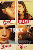 The film posters of "Trade" all contain four striking images that signify what to expect in the film. The poster on the left is more dominant and conveys more emotions. The poster on the right is fairly plain with similar camera shots this makes the poster less eye catching to the audience with no real bright colours used the poster is dull.
The film poster of "Don't say a word" works very well and suggests the film may be about the girl in the top picture from her facial emotions it's clear that she is scared however the poster does not reveal a lot about the film. Micheal Douglas is in bold at the top of the poster which conveys that he must play a big roll in the film as his name has been distinctively put there. Not much information is listed about the film although this could be due to having more than one trailer, most films trailers don't display massive amounts of information about the film as this will give the narrative of the film away.
"Kidnapped" highlights a different approach to grabbing the audiences attention. Minimal information is displayed on the poster. However, a striking image takes up the vast space displayed on the page. The picture has a lot going on and by the film name "kidnapped" its evident that a kidnapping occurs so the picture doesn't give to much away. Again in this picture editing is minimal, the font however is bold and stands out. In some respects it could be argued that the font over powers the picture, by looking at the poster the audience is drawn to look at the font first. The strong powerful phrase "home used to be a safe place" this highlights that something bad will happen from home, suggesting that the main location of the film will be inside a house.
Little white lies examples
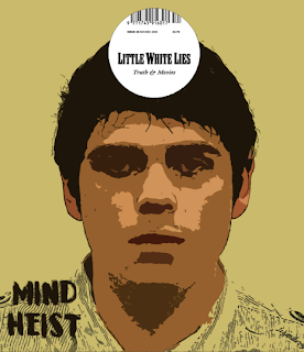
After identifying that little white lies would be our magazine company we researched in more detail the different styles and of images and the effects that are used. It was also interesting to see how text was included to revolve around the picture. From this the draft of our magazine front cover has been established.
Wednesday, 9 January 2013
Story Board Development
From deciding as a group we felt that the trailer needed some more shots therefore I produced another storyboard including a final three shots that will help link the trailer together as well as including our title timings within our trailer.
The shots included are a panning opening shot of Corfu. The shot is interesting as it overlooks Corfu with a contrasting light and dark sky that makes the shot unusual and I felt that it would me a great opening shot to use in our trailer. As in some respects it links the trailer together. The second shot is a picture of Matt's phone where he has 10 missed calls from Jodie after the argument which he chooses to ignore, this shot will create tension and link the trailer better together, furthermore it is reflects our film name. The final shot is a shot of Matt in Corfu asking a lady along a road where he can find the address listed on the card he found at Jodie's, again this scene will create tension and link the film trailer together better.
The shots included are a panning opening shot of Corfu. The shot is interesting as it overlooks Corfu with a contrasting light and dark sky that makes the shot unusual and I felt that it would me a great opening shot to use in our trailer. As in some respects it links the trailer together. The second shot is a picture of Matt's phone where he has 10 missed calls from Jodie after the argument which he chooses to ignore, this shot will create tension and link the trailer better together, furthermore it is reflects our film name. The final shot is a shot of Matt in Corfu asking a lady along a road where he can find the address listed on the card he found at Jodie's, again this scene will create tension and link the film trailer together better.
Looking at action magazines
Possible magazine companies
When creating the magazine front cover for our film “10
missed calls” we need research possible magazine companies that we can use.
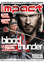
Impact Magazine
The first possibility was the magazine company impact. This magazine we perceived looked unsuitable to attract our target audience. Furthermore, it also lacked the codes and conventions that we were looking for in a magazine lacking an iconic picture. Although, from this magazine we could use some ideas. For example the layout of the magazine is effective however this magazine does not reflect an action theme.
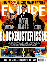
After rejecting impact magazine we looked into empire magazine. After researching different issues it was clear that empire was to broad in terms of a specific target audience for specific film genres. Therefore this magazine company also had to be rejected. From looking at empire magazine we did like the iconic picture with minimal amounts of text surrounding the picture it made the picture stand out more and make the overall style of the magazine more effective as everything is revolved around the picture.
Little white lies Magazine
After further research we found the magazine company little white lies. As I have already addressed the iconic picture is imperative to best attract our target audience and feature our film therefore this magazine company was perfect. We feel that with a little editing the pictures we have taken can be adapted to a white lies magazine front cover.
What a film magazine includes
Empire is a British film magazine published monthly by Bauer Consumer Media. It is the biggest selling film magazine in Britain.
"Empire writers select the smart, arty and expensive movies that sum up the magazine for them. From the brilliant to the bizarre, Fight Club to... Twin Peaks: Fire Walk With Me?! Pithy writing, inspired (and odd) choices."
Features
Each Month Empire provides a wide range of different features, from full coverage from this years award ceremony, to full-length interviews and photo shoots with established up and coming actors and directors. To the previews of major films such as Les Miserables. All issues contain a one page parody of recent releases and a film interview- with a detailed chat with a casting actor or major director.
Key sections within the magazine
Dialogue
This section is about the interaction between the readers and the magazine. Where Empire readers get the change to declare what they want from specific future releases. The interaction can be from the magazine's social media followers such as forums, facebook and twitter.
Buzz
This section includes "sneaky peeks" from exclusive on set visits and videos and first look pictures from upcoming films. Also includes the latest movie news on the latest trailers and news on actors.
Reviews
With every new movie for that month reviewed and rated. Major releases recieve comprehensive coverage, the star rating is usually out of five. The section also includes a brief listed recommendations "see this if you liked" It also includes the UK and the USA box office charts.
The Empire Quiz
A double page spread with questions answers and clues. Empire also features a monthly competition, entered by post,text message or online. The prices usually related to a film experience or activity.
Tuesday, 8 January 2013
Experimenting colouring for the magazine front cover
An iconic picture is imperative when constructing a magazine front cover. I have spent some time editing my chosen picture into different colours to see which looks most appealing to my target audience. Colouring is important as the magazine front cover relies heavily on the main picture the colours displayed gives an indication to the theme or the genre of the magazine.
Thursday, 3 January 2013
Editing Title Sequence
To stand out to the mass audience unique features about our trailer had to be considered therefore we proposed the idea of not only cutting the length and incorporating background sound for a trailer title sequence but also editing the colour and saturation of the title sequence.
Wednesday, 2 January 2013
Production Logo
After constructing our film trailer we had to outline which production company would produce the film. As our film is based on a relatively mass audience we decided that paramount pictures would be a perfect company to use. Therefore, like most trailers at the beginning of the film we edited our own paramount pictures title sequence that we would use with the addition of background music.
http://www.youtube.com/watch?v=HIv1Em9FKZw the video cannot be incorporated into this post therefore a hyperlink is made to our edited title sequence.
http://www.youtube.com/watch?v=HIv1Em9FKZw the video cannot be incorporated into this post therefore a hyperlink is made to our edited title sequence.
Peer Feedback
This was my second piece of feedback from my peers and again I was happy with the response from my peers about my blog. All the recommended improvements from my previous peer feedback post were completed and my blog was updated.
Dow- "From reading your blog its clear you have been busy. Your posts are still really good you also have good detail and write your posts in a fluent manner. Make sure you add as much multimedia as possible in every single post you put up. Keep using a variety of features such as Wordie to display your posts in a different way. And make sure when uploading youtube videos into your blog you insert the video through youtube and don't just put a link into the post."
Kassie- "Will your blog is still very impressive. Your storyboard is good but have you stuck to it? If not do a post on the changes that you have made producing another storyboard. Think about producing an animated storyboard which you can film and will give you an idea of the length and variety of shots you will need to complete your film trailer."
Monthly Diary December 2012
This month has been a very productive month. As a group we have all worked hard into completed assigned tasks. Sadie has foccussed on constructing a storyboard and using shots that she has produced to incorporate it into the story board. Brandon has been editing our feedback and editing our title sequences. Frankie has been editing our presentation that was performed to the class. Whereas will has been looking at props and soundtracks and possible locations for our filming. Towards the end of the month we focussed on our filming and have now completed all of our filming and edited most of our footage and produced a first draft for our trailer. At this stage the sounding has not been produced so the first draft lacks sound which does make a signifcant different as the music is incorporated to create tension.
Feedback from our initial trailer
Within class today we showed the class our initial trailer. We asked for one thing they liked about the trailer and one thing they did ike about the trailer.
Alex- " I like the title sequence at the beginning, it looks good"
- "I dont like the fact you haven't got much dialogue"
Dan- "I like the contrast between some shots of light and dark"
- "I dont like the title in the clouds at the beginning"
James- "The build up is really good, your music is excellent"
- "some shots are filmed in different quality this makes it look not professional"
Dow- "The final scene is impressive"
- "At times some shots seem a bit out of place"
Subscribe to:
Comments (Atom)


.png)


