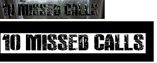
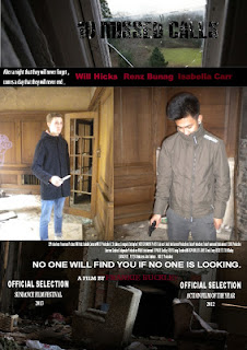
 For our audience pitching to a mass audience it was crucial that we decided on a suitable font that would appeal to our target audience. Using DAFONT we established the font "ActionBold" that replicated exactly what we were looking for. The next step was incorporating our font into our film trailer and our film poster as my magazine was "little white lies" incorporating our film title into this would of gone against the little white lies concept therefore the film title was not added to the magazine front cover. Using synergy is also important, in this case our synergy was created by all three media forms, iconic pictures were manipulated on both the film poster and the magazine as replicating the main actors is also another method used to create synergy.
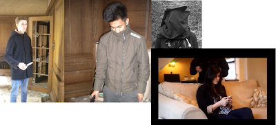
Clothing was also a fundamental factor when combining the link between the main task and ancillary texts. Throughout the clothing was kept specific to fit the criteria needed of their roles. Researching into what our characters was not a problem as we simply wore what we would normally wear being school students. Although linking to our ancillary texts we ensured to the decoder that this would be done through using the same clothes in the magazine front cover, film poster and the film trailer.

 Furthermore, colour is another way that will attract our target audience. Our colour preferences needed to be outlined in our film poster and magazine poster to portray the concept of our film trailer. By this I mean that the film poster needs vast amounts of light however with a contrast of dark to make it stand out. This will also replicate our film trailer that has a transition of light to dark .
The only difficult aspect of creating synergy was through creating a consistent symbol that we could relate to our film poster and magazine as well as our film trailer. Selecting an action genre meant that this would be a difficult task. So be improvising we used ancillary texts to reflect the symbolism. By this we incorporated our tag line into not just our film trailer but also into our film poster which reflected the symbolism of passion and the pain that the couple had gone through. Furthermore, in terms of the magazine creating a suitable magazine that would reflect the same codes and conventions of the film poster and film trailer was also a difficult task. Little white lies are usually bright and colourful and in some aspects reflecting happiness and passion. However, I used editing and an iconic picture to contradict this concept and aimed in making my magazine reflect pain and a sense of feeling "trapped". This shows that even when attaining synergy through all media formats their is always one aspect that is harder to create synergy.
Overall I feel that using forms and conventions as a platform was pivotal to create synergy, I feel the process throughout the production of these tasks has gone very well and I have in-turn, created three products that can relate to the same film trailer. With this in mind I feel the aspects I used create a combination between all three, which gives a good idea of the genre and target audience of the film, therefore its evident that the combination is highly effective.


No comments:
Post a Comment