Before constructing my film poster it is imperative that I research around film posters from my film genres and the codes and conventions that they contain. From my research its evident that for an iconic film poster colours need to be addressed. Before researching film posters I planned to construct a film poster consisting of a editing picture that would be dark with a striking image within the picture that would draw the audiences attention. However, from my research I have discovered that to correspond with my film genre no magazines use this concept therefore it would not be suitable for me to do so. Therefore instead its evident that most film posters display more than one image. In terms of my magazine I would like 4 images a extreme close up of Giannaz (The kidnapper) an extreme close up of Jodie (Girl who gets kidnapped) and a close up of Matt (Jodie's boyfriend) with a medium shot of the abandoned house which will signify where Jodie gets taken. All four images will be striking and grasp the audiences attention. From my research it is clear that a lot of action/thriller movies use this concept as their film poster.

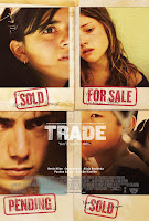
The film posters of "Trade" all contain four striking images that signify what to expect in the film. The poster on the left is more dominant and conveys more emotions. The poster on the right is fairly plain with similar camera shots this makes the poster less eye catching to the audience with no real bright colours used the poster is dull.
The film poster of "Don't say a word" works very well and suggests the film may be about the girl in the top picture from her facial emotions it's clear that she is scared however the poster does not reveal a lot about the film. Micheal Douglas is in bold at the top of the poster which conveys that he must play a big roll in the film as his name has been distinctively put there. Not much information is listed about the film although this could be due to having more than one trailer, most films trailers don't display massive amounts of information about the film as this will give the narrative of the film away.

"Kidnapped" highlights a different approach to grabbing the audiences attention. Minimal information is displayed on the poster. However, a striking image takes up the vast space displayed on the page. The picture has a lot going on and by the film name "kidnapped" its evident that a kidnapping occurs so the picture doesn't give to much away. Again in this picture editing is minimal, the font however is bold and stands out. In some respects it could be argued that the font over powers the picture, by looking at the poster the audience is drawn to look at the font first. The strong powerful phrase "home used to be a safe place" this highlights that something bad will happen from home, suggesting that the main location of the film will be inside a house.

 The film posters of "Trade" all contain four striking images that signify what to expect in the film. The poster on the left is more dominant and conveys more emotions. The poster on the right is fairly plain with similar camera shots this makes the poster less eye catching to the audience with no real bright colours used the poster is dull.

No comments:
Post a Comment